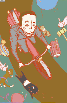
1950's
March 31, 2010
A Peek at the Patterns
For my "mini thesis" project in Illustration I've been designing four tiling patterns, each based on a different decade. These are the initial work ups that I pasted together from some sketches- there are still definite changes to be made. At the moment the '50s is my favorite. (And if you have any suggestions for '80s items, feel free to hit me up! Anything that can be recognizable sans human. So... not leg warmers. Thanks!)
March 30, 2010
Kindergarten Perspectives aka Genius
 In my spare time I've been typing up a book for my kindergarten class featuring answers each of the kids gave to simple questions- What does the President do, Where you do want to live when you grow up, etc. I had a copy of last year's, which while very amusing featured a front page full of clip art. I set out to make this year's a bit... dare I say it, better? It was done quickly, but I didn't want anything too sophisticated, obviously- the majority of contributors were five. Oh, and that's supposed to be a hawk there. It's the school's mascot.
Here were some of my favorite answers:
What do you like about yourself?
Jeremy: I like my head.
What does the President of our country do?
Adam: We pay taxes and he gets the money.
Emilie: He sits and waits for people to come to him.
If you had a lot of money, what would you do with it?
Maya: Buy Taylor Swift if I could. Buy my brother and sell him to the gypsies.
March 26, 2010
Two Chairs
I've been experimenting with photo polymer etching in my digital printmaking class. For these two I made two separate channels for each of the colors, and then erased parts so that I'd have part that were pure blue, pure yellow, and then a mix of the two where they overlapped. Then I printed each channel out on a transparency and exposed them on top of a plastic plate with film adhered to it. After developing the film, there are little grooves in the plate wherever the black on the transparency was, and from there on you can ink it up like a normal etching. These are two of the more "perfect" ones.


Ford & Flowers Finished
Here's one of the finished prints from my original design. This one wasn't included in the edition for the print exchange because there was no way I was going to be able to duplicate that slightly messy background, but I do love the way it looks. (For some reason when I scanned it in the background bits that were a smudged sepia just look yellow and weird... *needs a new scanner*)


March 24, 2010
Last Pee-Wee, I Promise
As per Marisa, here is the Finished version of Mr. Herman, with the line work tweaked.

March 21, 2010
I Heart: Liberty of London
Pee-Wee!
March 14, 2010
Pee-Wee Preview
March 10, 2010
Irish Fest 2010
Last time I went to Irish Fest it was hard paying attention to my surroundings- it was my first date with the Benj. Now that the tables have turned/done a total 180, I was forced to revisit it by working on the poster for this year's festival for my illustration class. The first version I wasn't terribly happy with- it felt drab and boring and sure, the sheep were kind of cute but that's really all it had going for it. In the second final I changed the background color to something that wasn't green green and attempted to have fun with that damn typeface.


Subscribe to:
Comments (Atom)


